Storefront Settings
Everything we have covered so far is admin work — bulk editing, variation management, media curation, importing. The Settings tab is different. This is where you control what shoppers actually see on the storefront when they land on a product page.
By default, WooCommerce and your theme handle product page galleries. They do a fine job. Bossy's Settings tab is for shops where "fine" is not enough — when your photos are your product (jewelry, art, prints, handmade goods) and the default gallery just is not doing them justice. Five gallery layouts, fine-grained thumbnail controls, variation gallery behavior, and personalization input sizing all live here.
Settings save requires the manage_options WordPress capability — by default, only Administrators have this. Shop Managers can VIEW the Settings tab but cannot save changes. If your staff needs to adjust Settings, they need Admin role temporarily, or you do it for them.
6.1 The master switch
The first card on the Settings tab is the most important toggle in the entire chapter. Get this one right and everything else flows. Get it wrong and nothing else matters.
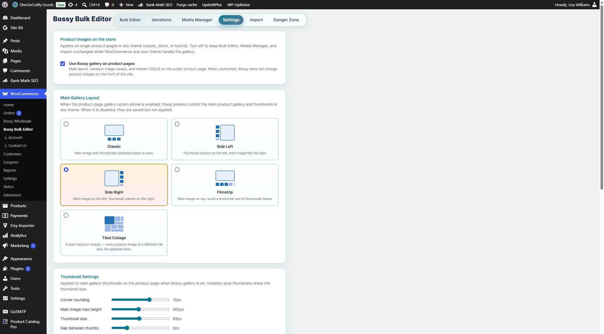
Use Bossy gallery on product pages. When checked, Bossy takes over rendering the product gallery on the front-end of your store. Bossy's CSS, JS, and HTML structure replace whatever your theme and WooCommerce shipped with. The gallery layout you pick below, the variation swap behavior, the thumbnail controls — all of it activates.
When unchecked, Bossy does NOT touch your product page gallery. WooCommerce and your theme handle the gallery exactly as they did before you installed Bossy. The Bulk Editor, Media Manager, and Import tabs all keep working — only the storefront display reverts.
6.2 Main gallery layouts (the five presets)
When the master switch is on, Bossy uses one of five gallery layout presets for your main product gallery. Each is a different visual treatment of the same content (your product's featured image and gallery images). The Settings tab shows them as visual cards with diagrammatic previews — you do not have to imagine what each layout looks like before picking one. Click the radio button on the layout card to select it.
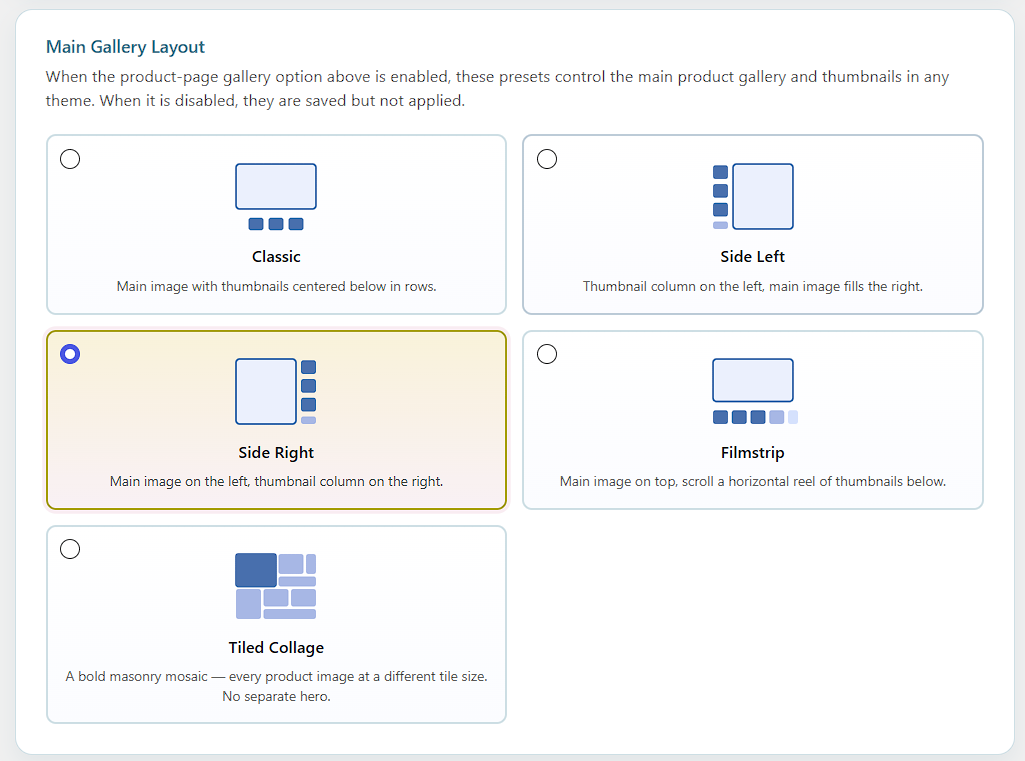
Classic (the default)
Main image centered at top with thumbnails arranged in rows centered below. The traditional WooCommerce-style gallery layout, refined. Polished, balanced, easy to scan. Good for most shops — handmade goods, jewelry, accessories, prints — where you want the photo to feel premium without imposing a strong directional read on the shopper.
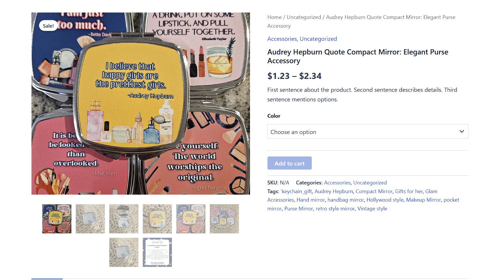
Side Left
Thumbnail column on the LEFT, main image fills the area to the right. Feels editorial. The vertical thumbnail strip reads top-to-bottom like a contact sheet, encouraging deliberate browsing through your gallery before settling on the hero shot. Good for products where every angle matters and you want the shopper to walk through them in sequence.
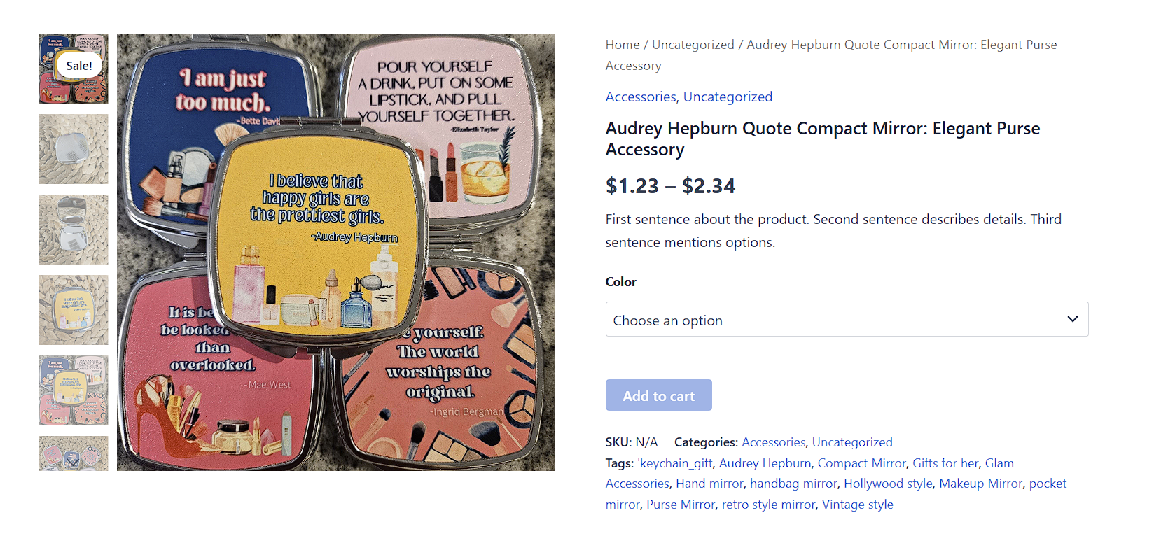
Side Right
Mirror of Side Left — thumbnail column on the RIGHT, main image on the left. Useful when your theme's product info panel (price, Add to Cart, description) sits on the LEFT side of the product page and you want the gallery thumbnails to align with the info side. Also helpful when right-handed scanning matters for your particular audience (Western reading order generally flows left-to-right; Side Right places the thumbnails at the natural endpoint of that scan).
Filmstrip
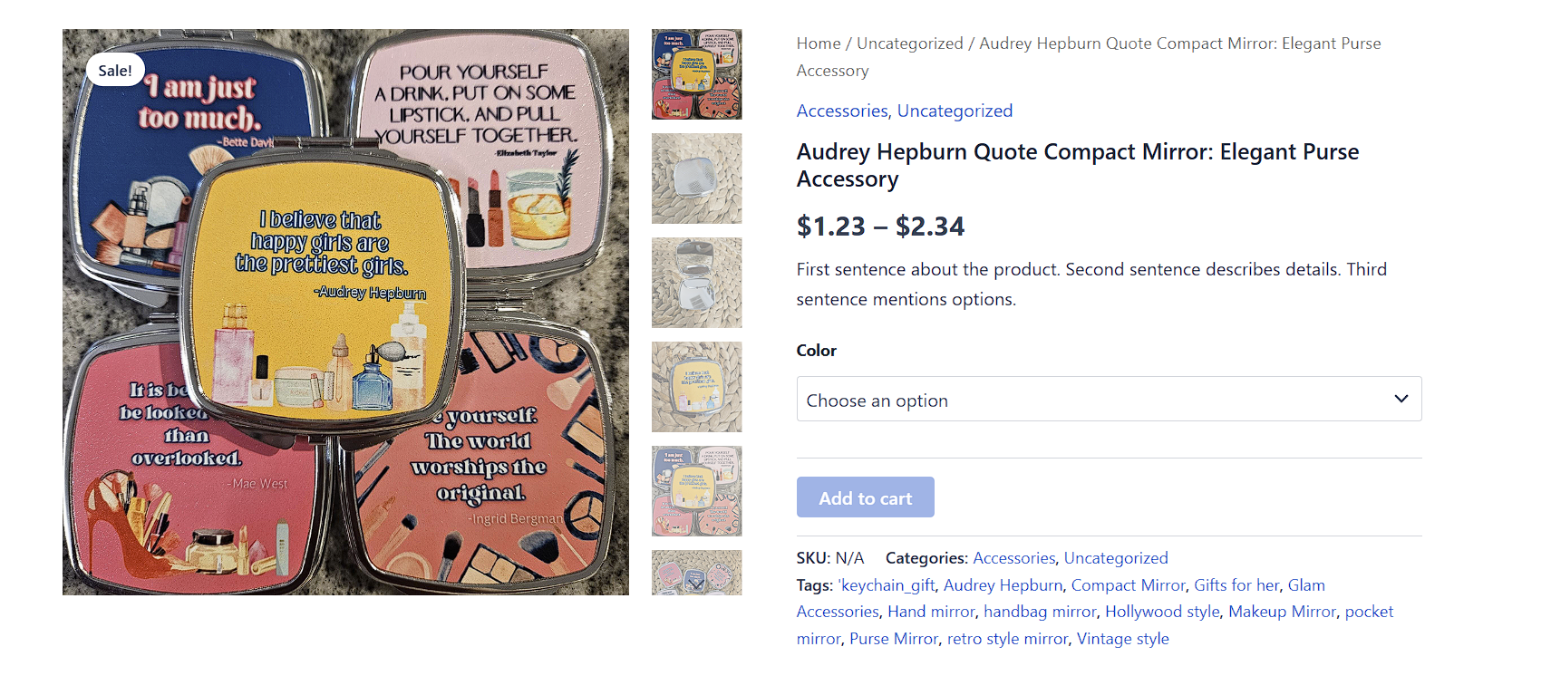
Main image at the top, scrollable horizontal reel of thumbnails BELOW. Photographic, modern, "contact sheet" energy. The thumbnail row encourages shoppers to swipe or scroll horizontally through your gallery, which can feel more engaging on mobile devices where vertical space is precious. Good for products with many gallery images (10+) where a vertical column would feel cramped.
Tiled Collage
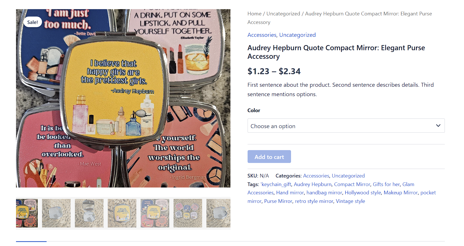
A bold masonry mosaic — every product image displayed simultaneously at varying tile sizes with no separate main hero. All images share the canvas in a quilt-style grid. Different sizes create visual rhythm: some images span double-width tiles, others fill smaller slots. Striking for art prints, textile work, or any product where the full set of images is part of the story. Works best with 4 or more gallery images; with fewer than 4, the mosaic has little to work with and one of the linear layouts will look cleaner.
6.3 Thumbnail settings
Below the layout picker is a card of fine-grained controls for thumbnail appearance. These apply to the main gallery thumbnails (in any layout that shows them) and the variation strip thumbnails.
Corner rounding — a slider that controls how rounded your thumbnail corners are. 0 = sharp square corners. Higher values round more aggressively, up to fully circular at the max for square thumbnails. Match this to your shop's overall visual style (sharp corners feel modern/clinical, rounded feels friendly/warm).
Main image max height — caps the height of the large product image. Useful for keeping the gallery from dominating long product description pages. Lower the value if shoppers have to scroll past the image to read details; raise it if your photos are your selling point.
Thumbnail size — how big the thumbnails are. Smaller thumbnails fit more in a row but show less detail. Bigger thumbnails are easier to tap on mobile.
Gap between thumbs — the spacing between thumbnail tiles. More gap = airier, more design-y feel. Less gap = denser, more catalog-y feel.
Thumbs ↔ image gap — the spacing between the thumbnail strip and the main image. Tweak this when the thumbnails feel either crowded against the main image or floating too far away.
Hide thumbnails checkbox — turns off thumbnails entirely, showing only the main image. Use this for products with a single hero shot where additional thumbnails would clutter the page. Shoppers can still navigate the gallery with swipe gestures on mobile if your theme supports them.
6.4 Variation galleries
Variation galleries are a Bossy-specific feature: when a shopper selects a variation attribute (like a color or size), Bossy can swap the displayed gallery to show images specifically tied to that variation. The settings in this card control how that swap behaves on the storefront.
This card applies when both the master switch is on AND you have variation galleries set up in the Bulk Editor (Chapter 3).
Variation count — no minimum
Bossy supports any number of variations — there is no minimum and no “needs 4+ variations” rule. A product with 3 variations behaves identically to one with 12 or 50. Bossy loops all child variations, builds gallery data for each, and swaps the displayed gallery when the shopper selects the matching attribute combination (for example, Red, Blue, or Green on a 3-color product).
Attribute gallery rows
Bossy reads every variation attribute on the product form (Color, Size, Material, and so on) and can show a stacked gallery row per attribute above the main gallery. Three attributes means up to three gallery rows — each one updating independently as the shopper makes selections.
When a shopper changes any dropdown, swatch, or radio:
- That attribute’s row updates immediately, even before all attributes are picked.
- When WooCommerce finds a full valid combination, Bossy syncs again on
found_variation. - Each row pulls images from variations that match that attribute’s current value.
There is no attribute-count limit in the Bulk Editor. A product with 3 attributes can have many variations (for example, 3 colors × 4 sizes × 2 materials = 24). Bossy loads all of them and lets you assign images per variation, or per-attribute galleries in Pro.
What you need for attribute rows to show:
- Bossy galleries enabled — Settings → Gallery master switch must be on.
- Images assigned per variation — empty variations have nothing to swap to. If only Color has images, only the Color row shows; Size and Material rows stay hidden until those attributes have gallery data.
- Shoppers pick attribute values — rows appear as selections are made.
Fallback order
If a variation has no images assigned, Bossy falls back in this order:
- Variation featured image — the main image assigned to that variation in the editor.
- Variation gallery — images assigned in Bossy’s variation editor (Chapter 3).
- Parent product gallery — up to 5 parent images if the variation has none.
The fallback ensures shoppers always see something on the product page, even on partially-imaged products.
Limits worth knowing
- Variations per product — no Bossy cap; WooCommerce limits apply.
- Images per variation gallery — 12 slides by default, filterable up to 30.
- Parent gallery fallback — up to 5 parent images if a variation has none assigned.
Disable zoom / lightbox on variation galleries. When unchecked (default), shoppers can click a variation gallery image to open it in a full-screen lightbox view. When checked, the click-to-zoom behavior is turned off and images stay inline. Check this if your theme has its own lightbox that conflicts with Bossy's, or if you are dealing with image rights issues where you do not want shoppers easily saving full-resolution copies.
Show thumbnails on gallery 1 (first attribute). When checked, the variation gallery for the FIRST product attribute (typically Color or Size, depending on your setup) shows thumbnail navigation. When unchecked, gallery 1 shows only the main image with no thumbnails.
Show thumbnails on gallery 2 (second attribute). Same control for the SECOND product attribute. Two-attribute products (like Color + Size combinations) often work better with thumbnails on one attribute axis and not the other — typically thumbnails on Color (which has visible variation) and no thumbnails on Size (which does not).
Max image height slider — height cap for variation gallery images, similar to the main gallery max height but specifically for the variation-triggered swap.
Left offset slider — controls horizontal positioning of the variation gallery panel. Useful when your theme's product layout has padding or margin that misaligns the variation gallery from the main gallery position.
6.5 Custom Input Field (storefront personalization)
When a product has personalization enabled (via the Custom Field column in the Bulk Editor, covered in Chapter 9), customers see an input field on the storefront where they type their custom text — a name to engrave, a date to print, a custom message. These two sliders control how that field appears.
Max input characters — the character limit on the personalization input. Customers cannot type beyond this number. Set it to match what fits on your product: 30 for a name on a necklace, 100 for a longer engraved message, 200 for a custom note inside a card.
Input field width — how wide the input box is on the page, as a percentage. Lower values give you a smaller, more compact input. Higher values let customers see more of their text as they type.
Space above field — top margin in px between the personalization input and whatever element sits above it on the product page. Adjust if the input feels crowded against the price, the add-to-cart, or other product page elements.
Space below field — bottom margin in px below the input field. Useful when the field floats too close to the Add to Cart button.
6.6 Saving settings
A Save Settings button at the bottom of the tab commits every change you have made across every card.
Required capability: manage_options. If you click Save Settings and see "You do not have permission" or similar, your account does not have the right role. Switch to an Administrator account or have someone with Admin role save for you.
6.7 Theme compatibility and the cross-theme architecture
Bossy's gallery uses a dual-adapter architecture — different rendering strategies for block themes vs. classic themes. This is why it works cleanly across such different environments: it is not one universal approach forced onto every theme, it is two purpose-built ones.
Block themes (Twenty Twenty-Five and other FSE themes)
On block themes, Bossy uses server-side class injection. When WordPress renders the woocommerce/product-gallery block, Bossy filters the block's output via render_block_data to inject bossy-gallery bossy-gallery-{layout} classes and a data-bossy-layout attribute into the gallery wrapper before the HTML reaches the browser. The CSS rules that apply your chosen layout are already tied to those classes, so they apply on the very first paint — no layout shift, no flash of unstyled content. This is what the codebase calls the "zero-CLS plan."
For the Filmstrip layout on block themes, Bossy additionally subscribes to the WooCommerce Interactivity API store (woocommerce/product-gallery) to sync filmstrip scroll position — using WooCommerce's own block architecture rather than working around it.
The block adapter is gated by wp_is_block_theme(). On classic themes, that check returns false and the entire adapter short-circuits immediately — no hooks attach, no processing runs, zero performance cost to classic-theme sites.
Classic themes (Storefront, Kadence, Astra, Blocksy)
Classic themes use Flexslider-based rendering — the standard WooCommerce gallery mechanism for classic themes — paired with Bossy's Flexy adapter for Blocksy's native gallery component. These adapters hook into the theme's existing gallery rendering pipeline rather than replacing it wholesale.
The Flexy adapter specifically detects Blocksy's gallery component and integrates with it, which is why Blocksy gets "full integration" rather than just compatibility — Bossy routes through Blocksy's own system rather than fighting it.
filmstrip, editorial, and ledge): filmstrip overflow is contained, the thumbnail rail's navigation chevrons render and sit in the correct layer over the main stage, and autoscroll follows the selected thumbnail correctly. If your gallery shows a filmstrip spilling past its rail or chevrons landing under the main image on Blocksy, make sure you're on the current version.Specific theme notes
Blocksy — full integration via the Flexy adapter. Bossy integrates with Blocksy's gallery component rather than overriding it. Works cleanly out of the box.
Kadence — works cleanly. Bossy's gallery replaces Kadence's default product gallery on single product pages when the master switch is on.
Astra — works cleanly.
Storefront (official WooCommerce theme) — works cleanly, as expected.
Twenty Twenty-Five — works cleanly via the block adapter with server-side class injection and zero CLS.
Other themes — should work, but heavy theme overrides on the product page template can cause visual conflicts. If your theme uses a custom single-product.php template, Bossy may need additional CSS adjustments. Contact support if your gallery looks broken after enabling.
6.8 Diagnostics Logging
At the bottom of the Settings tab is a Diagnostics Logging toggle: a single checkbox labeled "Enable Bossy diagnostics logging." It is off by default.
When you turn it on, Bossy writes structured runtime diagnostics to the server PHP log for its three highest-risk paths — schedule publish, row save, and undo restore. This is a troubleshooting aid: if a scheduled product never publishes, or a save silently fails on a specific store, the log gives support a real trail instead of a guess. Leave it off for normal day-to-day use; turn it on only while chasing a problem.
wp-content/debug.log when WP_DEBUG_LOG is enabled. Developers can also force logging on with the bossy_enable_debug_logging filter or forward entries to the WooCommerce logger via bossy_log_to_wc_logger, without touching this checkbox.Chapter 6 recap
- Settings tab is Pro-only. Free users do not see this tab.
- Settings save requires
manage_options— typically only Administrators. - The "Use Bossy gallery on product pages" master switch is the most important toggle in the chapter. Off = Bossy admin tools work but no storefront changes. On = Bossy renders the gallery.
- Five layout presets: Classic (default), Side Left, Side Right, Filmstrip, Tiled Collage — each shown as a visual card in Settings. Tiled Collage is a mosaic/quilt mode; works best with 4+ gallery images.
- Thumbnail sliders give fine-grained control over size, spacing, and corner rounding.
- Variation galleries swap images when shoppers select an attribute — only works if you have variation galleries set up in the Bulk Editor.
- Custom Input Field sliders control personalization field max characters, width, and top/bottom spacing — the actual personalization workflow is Pro and covered in Chapter 9.
- Diagnostics Logging toggle ("Enable Bossy diagnostics logging") writes structured logs for schedule, save, and undo paths — off by default, turn on only when troubleshooting.
- Dual-adapter architecture: block themes (Twenty Twenty-Five and other FSE themes) use server-side class injection via
render_block_datafor zero-CLS rendering on first paint; classic themes (Storefront, Kadence, Astra, Blocksy) use Flexslider + Flexy adapters. The block adapter is gated bywp_is_block_theme()and has zero performance impact on classic-theme sites. Tested cleanly against Blocksy, Kadence, Astra, Storefront, and Twenty Twenty-Five.